Hello,
my name is Sarah &
I’m a Visual Designer.
UX Case Study - Hotel Booking Process
My Role
UX Researcher and Designer
Tasks
• Conduct user research to determine the users journey in booking a hotel room.
• Uncover the pain points and issues users encounter during the booking process.
• Design the online booking process for a hotel group
Process
Research - Competitive Benchmarking | Surveys | User Interviews
Analysis - Affinity Diagram | Customer Journey Map
Ideation - Flow Diagram | Sketches | Interaction Design | Prototypes
Testing - Usability Tests
Tools
Figma | Miro | Zoom | Indesign | Pen & Paper
Overview
Creating a desktop website for a concept hotel group. Focusing on the booking process.
Evergreen Hotels are city hotels with a spacious and natural atmosphere.
The hotel group is based in Dublin with 12 hotels across Ireland.
Problem statement
Booking a hotel involves a lot of research, checking multiple other sources and there are many decisions to make along the way. Even down to the final stages of the booking process, decisions must be made continuously, often under time pressure. It can be overwhelming and exhausting for the user and can take the fun out of booking an exciting or relaxing trip away.
Goals
• Provide easy access to the information users need to make their decision
• Reduce decision fatigue by limiting unnecessary options
• Increase user confidence in booking with the hotel
Research
Some survey insights:
A survey amongst 25 participants showed that 90% of users searched for hotel accommodation using aggregator websites.
72% of those who used an aggregator also checked the hotel’s own website to compare
23% did not check the hotel website at all
Location, Price and Good reviews were cited as the most important factors users considered when deciding their hotel.
Usability Test
As this hotel is a fictional start-up, I conducted the initial usability tests using competitors websites.
The top reoccurring issues:
Users found that there was a lot of scrolling and too many options to look through. This was time consuming and often confusing.
Lack of confidence in the payment process where there was very little confirmation of the information before the user was expected to pay.
Not providing information upfront or easy access to elements, particularly imagery and reviews, caused either mistrust in the hotel’s credibility or caused the user to leave the website in order to find the information themselves. This added unnecessary time to the users journey and because of leaving the website potentially could lead to the loss of that customer.
Analysis
Affinity Diagram
After completing surveys, user interviews and usability tests it was time to group the information gathered into an affinity diagram. Along with a colleague, we used Miro to write important insights onto post it’s and organised them into similar groups. These formed the basis of determining the main problems to be solved.

Selection from Affinity Diagram
Customer Journey Map
Once a clear theme of issues presented themselves on the affinity diagram, I mapped out the customers flow through the average booking site, using the most common use case and noting the emotions, goals, behaviours and pain points that users encounter along the way. This allowed me to see which parts of the booking process really needed improving as well as which parts the user enjoyed.

Customer Journey Map
Ideation
I first sketched a flow diagram to determine the users path through the booking process, how many interactions and pages does the user need to get to the end. This helped me get a visual sense of how complex the booking process was and so it allowed me to start creating solutions as I drew up some low fidelity sketches. I drew up several iterations before arriving at a solution that felt like it covered users' issues. After this stage I moved onto Interaction Design element of translating those sketches into a functioning prototype. As the interactions came to life I noticed some issues in flow and uncovered better ways to do it as the design unfolded.

Sketch from Interaction Design
Design
Home Page
This desktop site is based on the use case of users knowing where they want to stay and being already familiar with the Evergreen Hotel brand. From all the research it seems that most users do a lot of their research “off-site” first (through search engines, aggregator websites, looking at deals, reviews, google maps, etc.) so by the time they get to the hotel website they already know roughly where they’re going to stay. Based on the established conventions, I put the search bar as the focal point on the homepage with the options to find more about the hotel on the top navigation bar and below the fold. This caters mainly for the user who knows what they want and wants to get stuck in to booking their hotel, as well as users that have been to the hotel before.
Calendar
The method of selecting dates was an issue for several users in usability tests. Calendars can be finicky, temperamental. My aim in creating the calendar for Evergreen was to make the process quick and intuitive with subtle affordances and confirmation of the selected dates.
The biggest problem I saw on competitors' websites was a calendar that reset dates and wouldn’t allow the user to adjust it easily.
“I would leave the site
if this kept happening”
- re: calendar picker resetting dates
To streamline this process I created the calendar so that the dates can only be selected chronologically. The first click sets the check in date. If a user clicks a date after this, it is set as the check out. However if the user clicks a date before the set check in, that date is now the check in date.

Results Page
Throughout all of the research a common theme developed, Searching for the ideal hotel involves a lot of back and forth, visiting external websites, opening new tabs, and trying to keep all of that information in mind while making a decision and getting the best value. Exhausting and complicated. So I wanted to give users the opportunity to easily compare several hotels on a single page and the ability to highlight potential options. I achieved this by allowing the users to select which hotels they wanted to compare and then the system reorders them to the top of the list displaying the three most important decision factors: price, location and good reviews.
“I’d need more information to decide.
Does it have a spa? I’d like to know about the facilities”
I conducted a usability test to see if this method was a good solution. While the users found it useful it was still too light on information to help them make a decision so I adjusted the design slightly. Instead of the user manually opening the dropdown menu to access more info, the menu automatically opens with the extra details. Then, as the user rules out hotels that don’t suit, they can collapse the drop down and deselect the comparison if they want.

Many users use the map as a visual guide, for example if they wanted to find a hotel close to the beach the map is the easiest place to look, especially as they may not be familiar with the geography of a new place. The map is already displayed next to the hotel list so there is no hunting for it. Clicking on a map pin shows a brief summary and also highlights the hotel in the main listing so there is no ambiguity as to which hotel you are looking at.
Hotel Page
Photos are another element that was hugely important to the user in picking their hotel. I placed these at the top of the hotel page and the user could click into them to make them larger. Good photos here are important as it gives a visual sense of the hotel.
Under this is a description of the room and a quick link to see the reviews. Users mentioned that if the reviews were not on the website they would just look for them elsewhere. By being upfront and providing the users with a link to reviews from tripadvisor we are saving them time and effort while also increasing the chances they will stay and book on the hotel site.
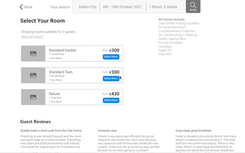
Room selection
The room rates are another area that often has too many options. To avoid an overwhelm of rates, an automatic filter is applied based on the users initial search. For example, if a user's search includes 2 adults, their room options will show all rooms suitable for at least 2 adults. The user can reveal all options if they wish.
The room images and extra information can be accessed by clicking on the image of the room or by clicking ‘see more’. This opens the same overlay with larger images of the room and a brief description of what’s included. The size of the room was very important to users, so the dimensions are listed here, however many users interviewed did not know how to judge the size from that and instead would use the room pictures to get a visual estimate of the size. This overlay caters for both.
“It’s too painful spending 5 minutes
looking through room rates”
Instead of displaying all rooms and rates together, which users said is “too painful to scroll through”, I decided to create a step by step process where the user is subtly guided through to the room rates. By only displaying the Room types, the user can decide on the room that they would like first. Once that is settled on they can choose a rate under that room by clicking “Select Rates”. The user has full control and can choose to look at other room types and rates whenever they wish.
Add ons
The add on page was expected by some users and unnecessary to others. For this reason I decided to make the add-on page easy to move past quickly whilst also keeping a short list of relevant add-ons for the users who needed it. I also took the opportunity to add a brief inclusion summary on this page as it was a recurring issue that there wasn’t a summary of what was included. This page now provides something useful for both types of users.
Payment and Confirmation
The payment page also shows the booking summary to give further reassurance to the user. To make sure the payment process is quick and easy I grouped the sections into just 3 steps; Guest details, additional requests and the card details.
A confirmation page appears after payment letting the user know the dates booked, the cancellation details and a note that they will get an email with all the details. From here the user has finished their journey on the website and can either save the confirmation details or return to the homepage. This page is intended to let the user know that everything has been taken care of and they can go about their day.
Thank you for reading this case study
You can view the prototype for this case study by clicking on the button below.
Please note this is a medium fidelity prototype so images aren’t included and not all features are clickable. Clicking on any area will provide hints to where you can click.